Conversion: why SME websites bring no customers

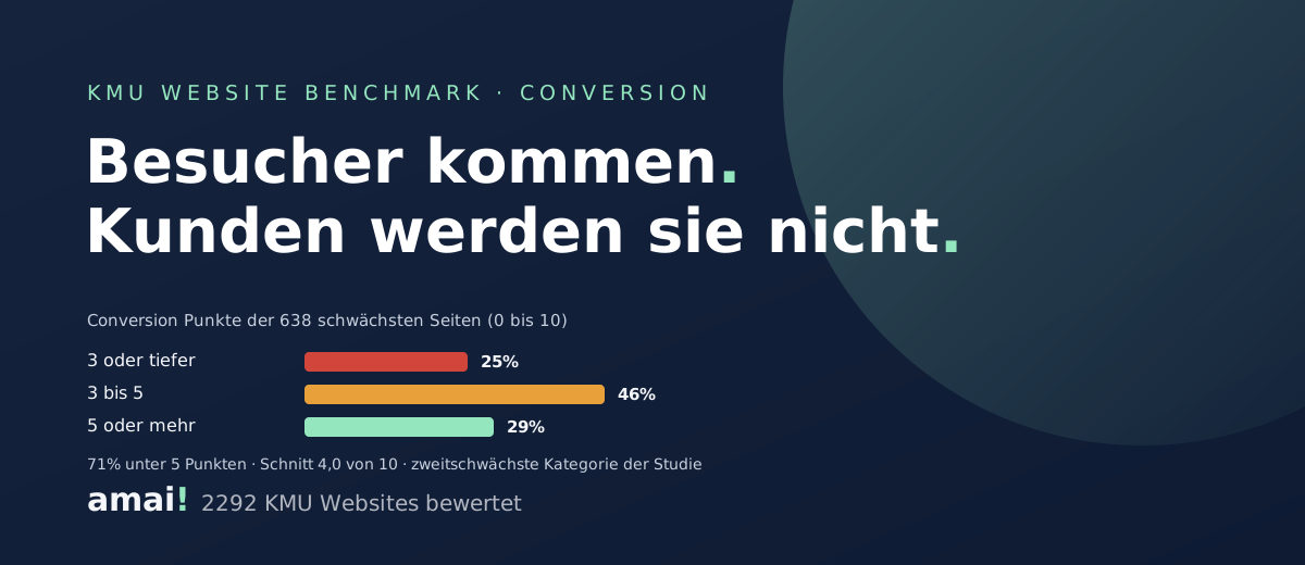
Visitors arrive. They do not become customers. On the Swiss SME websites with the greatest need for work, the conversion category averages only 4.0 of 10 points. 71 percent score below 5, a quarter at 3 or lower. That makes conversion the second weakest category of the whole study, after SEO and content. The cause is rarely technical: the sites simply do not tell the visitor what to do next.
How we measured
At amai! we continuously review Swiss SME websites against a fixed grid. We rated 2292 sites on a five level maturity scale. The 638 sites with the greatest need for work were also scored in eight categories from 0 to 10 points, one of them conversion. The numbers in this article therefore describe this weakest group specifically, not the average of all SMEs. The rating is indicative and based on visible website elements. All the detail and the overall results are in the SME website study.
The numbers
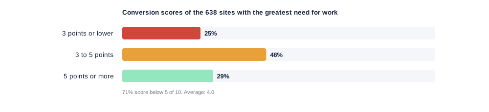
Conversion measures one simple thing: whether a visitor finds a clear next step without searching for it. Call, enquire, book, buy. Across the 638 sites the result breaks down like this:
- 3 points or lower: 25 percent. No call to action, contact hidden. The site works against the business.
- 3 to 5 points: 46 percent. There is a contact page. No visible path leads to it.
- 5 points or more: 29 percent. A next step is recognisable, often just one.
For comparison: positioning, first impression and design sit between 4.7 and 4.8 points in the same group. Many of these websites look tidy, they just lead nowhere.
The three faults that keep coming back
No clear call to action. The homepage tells who the company is. It does not say what the visitor should do now. No button, no sentence like "Call us" or "Request an appointment". Whoever is not guided scrolls and leaves.
The phone number as plain text. On a phone the number is visible yet not tappable. That is technically the case on around 5 percent of the sites. More often the number is linked. It just sits in the footer, three screens below the first impression. For a tradesperson or a practice that is the most expensive metre of the whole website.
Contact only after several clicks. Open the menu, "About us", then "Contact", then a form with eight fields. Every click costs a share of the visitors. On mobile, where most SME customers land today, it costs even more.
What it costs
A website with weak conversion wastes exactly the visitors who are already interested. They searched and clicked. Then the last step is missing. That hits SMEs twice, because most have only a few hundred visitors a month. Every lost enquiry weighs heavily. A second effect comes on top: AI assistants and Google favour sites where it is clear what a company offers and how to reach it. A distinct next step therefore also helps visibility. How the two connect is explained under GEO for Swiss SMEs.
Five fixes done in an hour
- One call to action in the first screen. A button with a concrete verb: "Request a quote", "Book an appointment", "Call now". The same one on every page.
- Make the phone number tappable. A
tel:link instead of plain text. On mobile a fixed button at the bottom of the screen. - Contact on every page. Address, number and email belong in the footer and at the end of every service page. Not only on the contact page.
- Shorten the form. Name, contact, request. Three fields are enough for a first enquiry. The rest comes in the conversation.
- Name the next step. Two sentences under the button: what happens after the click and how quickly you respond. That lowers the threshold noticeably.
None of these points needs a redesign, only a decision: what should a visitor do on this website? Once that is settled, the five points above are done the same day.
We rate your website against the same grid as the study, conversion included. We tell you honestly where visitors get lost and what the fastest first step is.
Request a free website analysis →Frequently asked questions
What does conversion mean for an SME website? Conversion means a visitor takes the next step: calling, sending an enquiry, booking an appointment or buying. The category measures how easy the website makes that step.
How weak is the conversion of Swiss SME websites? Across the 638 sites with the greatest need for work the average is 4.0 of 10 points. 71 percent score below 5, a quarter sit at 3 or lower.
What is the most common conversion fault? The missing call to action. The site explains who the company is without saying what the visitor should do. Close behind come the hidden contact option and the phone number as plain text.
Is a redesign needed to improve conversion? No. A button in the first screen, a tappable phone number, contact details on every page and a short form are set up in a few hours and work immediately.
Tom de Vree · founder of amai
Tom de Vree builds and maintains websites, digital platforms and automations for Swiss SMEs.